Right-wing media have spent months promoting a deceptive data chart from the anti-choice Americans United for Life that on September 29 became the cornerstone of Rep. Jason Chaffetz's (R-UT) cross-examination of Planned Parenthood President Cecile Richards at a House Oversight Committee hearing aimed at defunding the organization. The chart's data is out of proportion and neglects to document numerous services performed by the women's health care provider to make it appear as if most of what Planned Parenthood does is pregnancy terminations.
GOP Committee Chair Brandishes Data Promoted By Right-Wing Media At Planned Parenthood Hearing, Doesn't Realize It's From Anti-Choice Group
Media Fact Checkers: Chart “Makes Absolutely No Sense” And “Has No Y-Axis”
Published
Republican Committee Chairman Uses Deceptive Chart In Hearing Aimed At Defunding Planned Parenthood
Rep. Chaffetz Uses Deceptive Chart To Smear Planned Parenthood In Congressional Hearing. Rep. Jason Chaffetz (R-UT), the chairman of the House Oversight Committee, displayed a misleading chart while questioning Planned Parenthood President Cecile Richards during a September 29 hearing that suggested the number of abortions performed by the health care provider has spiked since 2006 as its other services declined. Chaffetz attacked Richards for “deny[ing]” the validity of the data, but was caught off-guard when Richards informed him that the data and graph he was relying on was provided by Americans United for Life (AUL), an anti-choice group. From an article in The Washington Post:
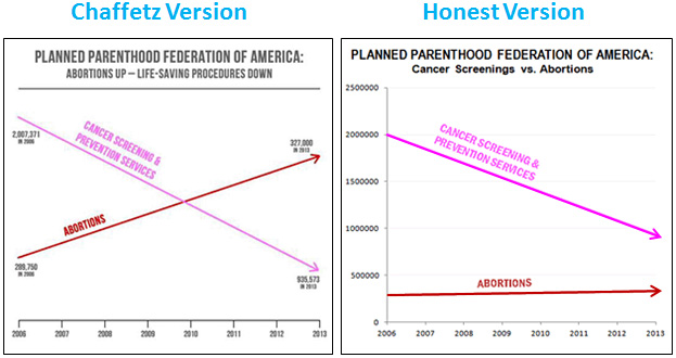
Chaffetz, who took the gavel for this often politically contentious committee at the start of the new Congress in January, put up a chart that purported to show Planned Parenthood's breast cancer screenings going down over time as the number of its abortions spiked.
Richards appeared flummoxed, saying she didn't know where those numbers came from.
“You're going to deny?” Chaffetz incredulously replied.
Richards said she would deny those numbers because she'd never seen them.
With every exchange, Richards and Chaffetz raised their voices until both were practically yelling over each other.
Chaffetz told her he pulled them from her corporate reports. “Oh,” Richards said, appearing deflated.
Then staff behind Richards leaned over to whisper into her ear. She interrupted Chaffetz. “Excuse me, my lawyer is informing me that the source of this is actually Americans United for Life, which is an antiabortion group,” she said. “So, I would check your source.”
It was Chaffetz's turn to appear deflated. “Then we will get to the bottom of the truth of that,” he said. [The Washington Post, The Fix, 9/29/15]
Conservative Outlets Publish Deceptive Chart Implying Planned Parenthood Performs More Abortions Than Other Health Services
The Daily Signal Uses Chart To Falsely Claim That “Planned Parenthood Is Embracing A More 'Abortion-Centric' Model.” In a June 25 article, The Daily Signal used deceptive statistics and the misleading chart from AUL to claim that Planned Parenthood is focusing on providing abortions, diminishing the work the organization does with preventative care and cancer screenings:
Using primarily Planned Parenthood's own data, AUL argues that Planned Parenthood is embracing a more “abortion-centric” business model.
[...]
Despite their growing abortion business, Planned Parenthood is treating fewer patients. Their client base has declined by almost 10 percent.
[...]
While the number of abortions performed by the organization has increased, their non-abortion services such as breast cancer screenings have been slashed by more than 50 percent.
Americans United for Life President and CEO Dr. Charmaine Yoest said in a statement that while Planned Parenthood “deceptively holds itself out as protecting women's health, as it cuts legitimate health care in favor of abortion sales, while lobbying for more taxpayer largesse.” [The Daily Signal, 6/25/15]
NRO Publishes Anti-Choice Group's Misleading Chart. In a July 30 article, National Review Online (NRO) asked prominent anti-choice “experts” what would happen if Congress defunded Planned Parenthood. Arina O. Grossu, the director of the an anti-abortion program housed at the Family Research Council (FRC) -- which the Southern Poverty Law Center has labeled a hate group -- falsely claimed that it “would free up over half a billion dollars a year that could go to a myriad of health-care service providers ... that provide a broader range of health services than Planned Parenthood ever has.” Grossu cited AUL and their deceptive chart to claim that abortion services at Planned Parenthood were on the rise, while non-abortion services were in decline. [National Review Online, 7/30/15]
The Daily Caller Uses Misleading Statistics, Chart To Imply That Planned Parenthood Performs More Abortions Than Preventative Services. In a September 23 article highlighting Richards' upcoming congressional testimony, The Daily Caller used the misleading charts and data from AUL to downplay Planned Parenthood's contribution to preventative health care and falsely imply that its primary service is providing abortions:
Since 2004, Planned Parenthood's client base declined by about 10 percent and the share of non-abortion services it provides dropped by more than 50 percent. But the share of U.S. abortions Planned Parenthood is responsible for jumped to a record high of 32 percent.
Although the national demand for abortions is declining, nearly 1 in 3 abortions happen at a Planned Parenthood clinic. In 2013, the clinics performed a total of 327,653 abortions. [The Daily Caller, 9/23/15]
AUL's Chart Has Been Called “Misleading” and “Disingenuous At Best”
MSNBC.com: Graph Chaffetz Used Was “Stunningly Misleading.” An article from MSNBC.com states that there were many problems with the graph Chaffetz presented at the hearing in his attempt to smear Planned Parenthood, including the fact that it has no “y-axis”:
A cursory look at the graph, which comes from an Americans United For Life report about Planned Parenthood centers released in June, makes it seem like in 2006, Planned Parenthood performed far more cancer screening and prevention services than abortions, but that by around 2010 it performed an equal number of both, and by 2013 it performed far more abortion services than anti-cancer services.
The issue is important because as part of their effort to defund Planned Parenthood, Republicans have portrayed it as primarily an abortion provider, while the group's defenders have said it mostly performs other women's health services, like cancer screenings.
But look at the actual numbers in the graph. They show that in 2006, Planned Parenthood performed 2,007,371 anti-cancer services and 289,750 abortions. By 2013, the gap had closed slightly, but the group still performed many more anti-cancer services than abortions, 935,573 to 327,000.
Why does it seem otherwise? Because the “graph” has no y axis, which allows its creators to simply plot the results wherever they choose in order to create a compelling visual effect. That's how 327,000 is made to look like a much larger number than 935,573. [MSNBC.com, 9/29/15]
National Memo: The Graph Was “Disingenuous At Best And Criminally Idiotic At Worse.” In a September 29 article, The National Memo argued that Chaffetz's hearing displayed “a nakedly partisan agenda” and “a complete dishonesty regarding basic math.” The article argued that the graph used by Chaffetz “made absolutely no sense” because there was no accurate scale to compare the number of abortions Planned Parenthood performed to the number of preventative care services they conducted, and concluded that the chart itself was “disingenuous at best” and “criminally idiotic at worse”:
Chaffetz repeatedly demanded that Richards explain the graph to the committee -- a tall order since it makes absolutely no sense. Even if we were to take the numerical data here at face value, the graph, as designed, is disingenuous at best and criminally idiotic at worse.
There is no proportion; each line behaves according to its own scale. A rise in the number of abortions from 289,750 to 327,000 (an increase of 13 percent) is illustrated as a sharp red line surging upwards, while a 53 percent decline in the number of preventative services is represented by an almost identical inverted slope.
Even worse, the lines intersect one another: The line representing the number of “cancer screenings and prevention services” (colored pink -- a cute touch), is seen being overtaken by the red line representing a supposed surge in abortions in the same seven-year period. The effect is that somehow 327,000 becomes a bigger number than 935,000. [The National Memo, 9/29/15]
Mother Jones: The Graph Ignores The Y-Axis. In a September 29 article in Mother Jones, Kevin Drum attributed the deceptiveness in the chart displayed by Chaffetz to an utter disregard for scale and proportion in the y-axis. Drum replotted the data “using conventional 'numbers' and 'slopes'” to show how the data would look if they were not misleadingly charted, and included another image which compared all “other services” provided by Planned Parenthood to the abortions it provides:
Rep. Jason Chaffetz displayed a chart that seemingly showed a huge increase in the number of abortions they've performed. Actually, though, the number has increased only about 2 percent per year since 2006. How did this happen? Well, it turns out that Americans United for Life, which made the chart, decided to ignore the y-axis. But I'm sure it was an honest mistake, probably due to poor math skills from a lifetime spent in the liberal public education system. So as a public service, I've replotted the data using conventional “numbers” and “slopes.” You're welcome.
[...]
[Mother Jones, 9/29/15]
Vox Corrects The Misleading Chart, Adds Vital Context On Other Services. In a September 29 article, Vox pointed out that chart used by Chaffetz makes it appear as if abortions performed by Planned Parenthood have risen dramatically while preventative services have been cut. Vox plotted what an accurate chart of Planned Parenthood services would look like, broken down into categories: Abortion services increased modestly, cancer screenings and contraception services declined, and STI/STI testing and treatment increased: [Vox, 9/29/15]