Conservative media hyped a misleading chart attempting to show that the number of Americans receiving federal disability benefits has reached unsustainable highs, comparing the figure of recipients to the population of random countries around the world. Accurate charts putting the figure in reasonable context, however, show that the number of needy Americans in this safety net program is astonishingly low.
On May 21 Fox News and the Drudge Report hyped the findings of conservative news site CNS which pushed the false idea that too many Americans are currently receiving Social Security Disability Insurance, stating that the number has reached “a new all-time record” and featuring a graph blasting the fact that more people get disability benefits than live in Greece and Tunisia:

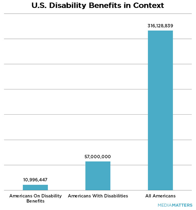
There are also more people in the state of Ohio than Greece or Tunisia, but that isn't cause for alarm. A more accurate graph showing the number of Americans who receive this necessary benefit shows that compared to the total number of Americans who have disabilities, and the total population of the U.S., relatively few individuals are on this government program:
Right-wing media have a history of misleading about federal disability programs as part of their campaign to deceptively portray the programs as wasteful and unsustainable. In reality, these programs have low fraud rates, are highly difficult to qualify for, and help the rising number of Americans with severe disabilities survive when they are unable to work.
UPDATE: CNS' original chart is even more misleading than Media Matters originally noted. Their chart starts the y-axis at 10.4 million, rather than zero, exaggerating the difference between the number of disability beneficiaries and the populations of various random countries. For better context, we have updated our improved chart to show what CNS' graph would look like if it included the full U.S. population at the correct scale and started the y-axis at zero:

Charts by John Whitehouse